LadyBLoves ReDesign
Welcome to a redesign that I did for the website LadyBLoves
The problem
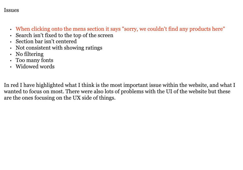
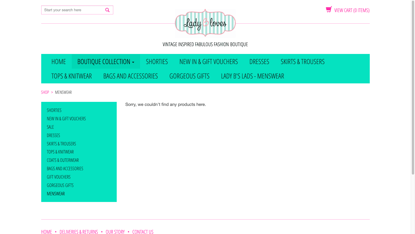
In our brief we had to redesign a problem within an app we found. I found this small business in Norwich and looked at its website. I found out many problems such as When clicking onto the mens section it says "sorry, we couldn't find any products here" the search wasn't fixed to the top of the screen, the section bar isn't centred, it isn't consistent with showing ratings, it had no filtering, too many fonts and widowed words.
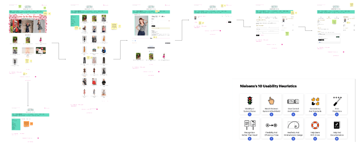
Sitemap
I started by creating a sitemap so that I could see how to website worked and what pages it contained that could have to be redesigned.

Heuristic evaluation
I then did a heuristic evaluation on the website so that I could highlight the major problems that I could focus on, while also looking into some smaller problems.
Issues found
After my evaluation I highlighted the issues found and ranked them from the most serious to least.
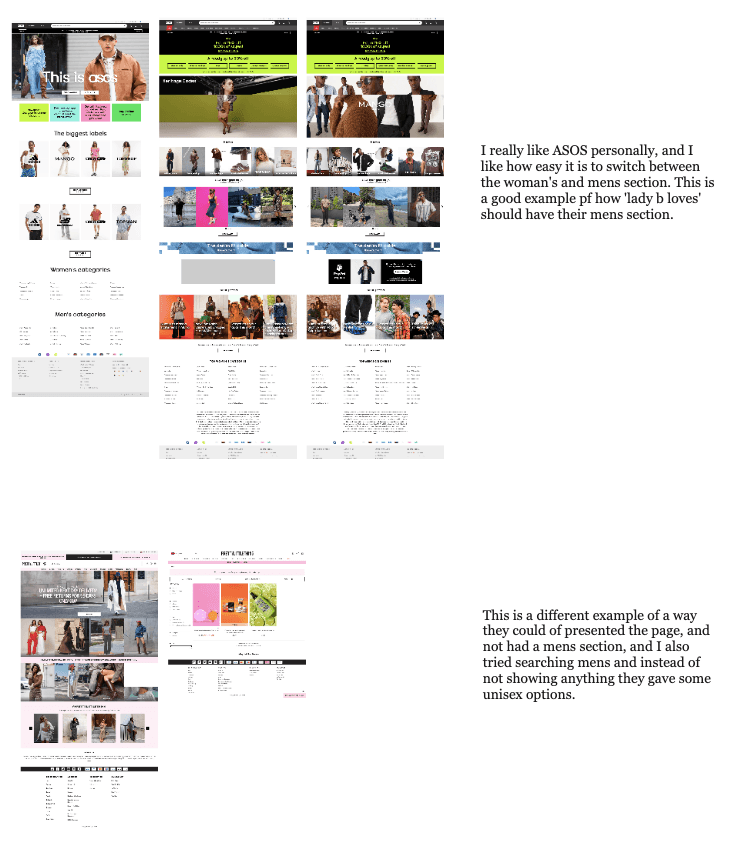
Better practices
I wanted to look at websites I knew had a good example of how an app should work, with this I could see how they have done it better so I can look at doing that in my redesign.
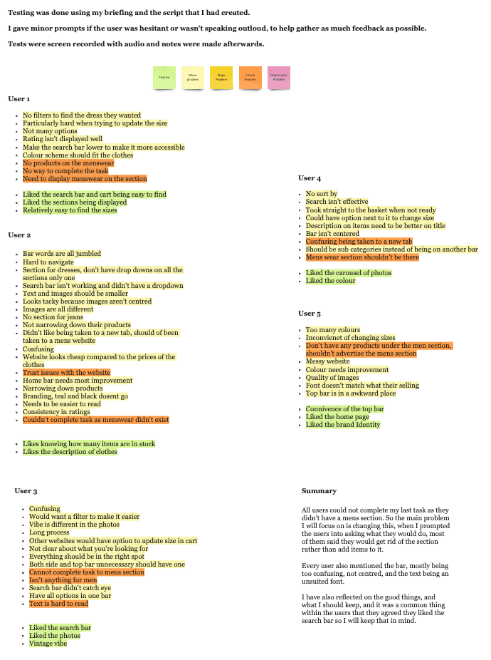
User testing
I then did some user testing so that I could see how others use the app, to see if they can find the same problems or more. This was great as they spotted things I hadn't and after this I then did a heuristic evaluation again and added more points to the website.
Wireframes
I was now ready to think about what I was going to redesign, I created some wireframes to think about the flow I was going to use. I decided to focus on the main issue of the 'mens section' as this was a major UX problem, but I also wanted to consider the UI parts of the design aswell as so many of my users picked up on it.
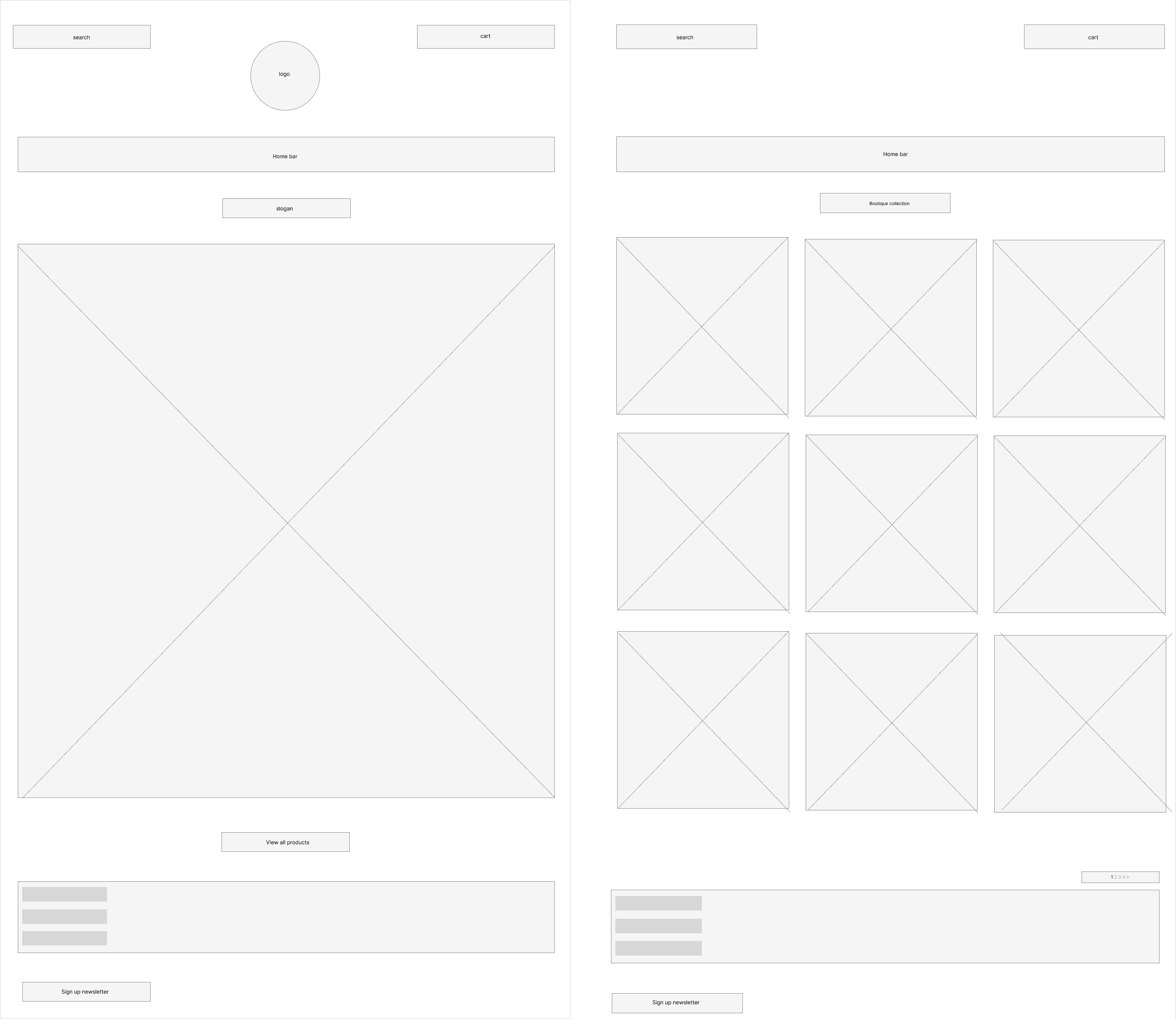
Final outcome
I created the frames while trying to keep the branding for LadyBLoves. My main focuses was the UX part, but I also touched upon the main issues within the UI from feedback from my user tests.

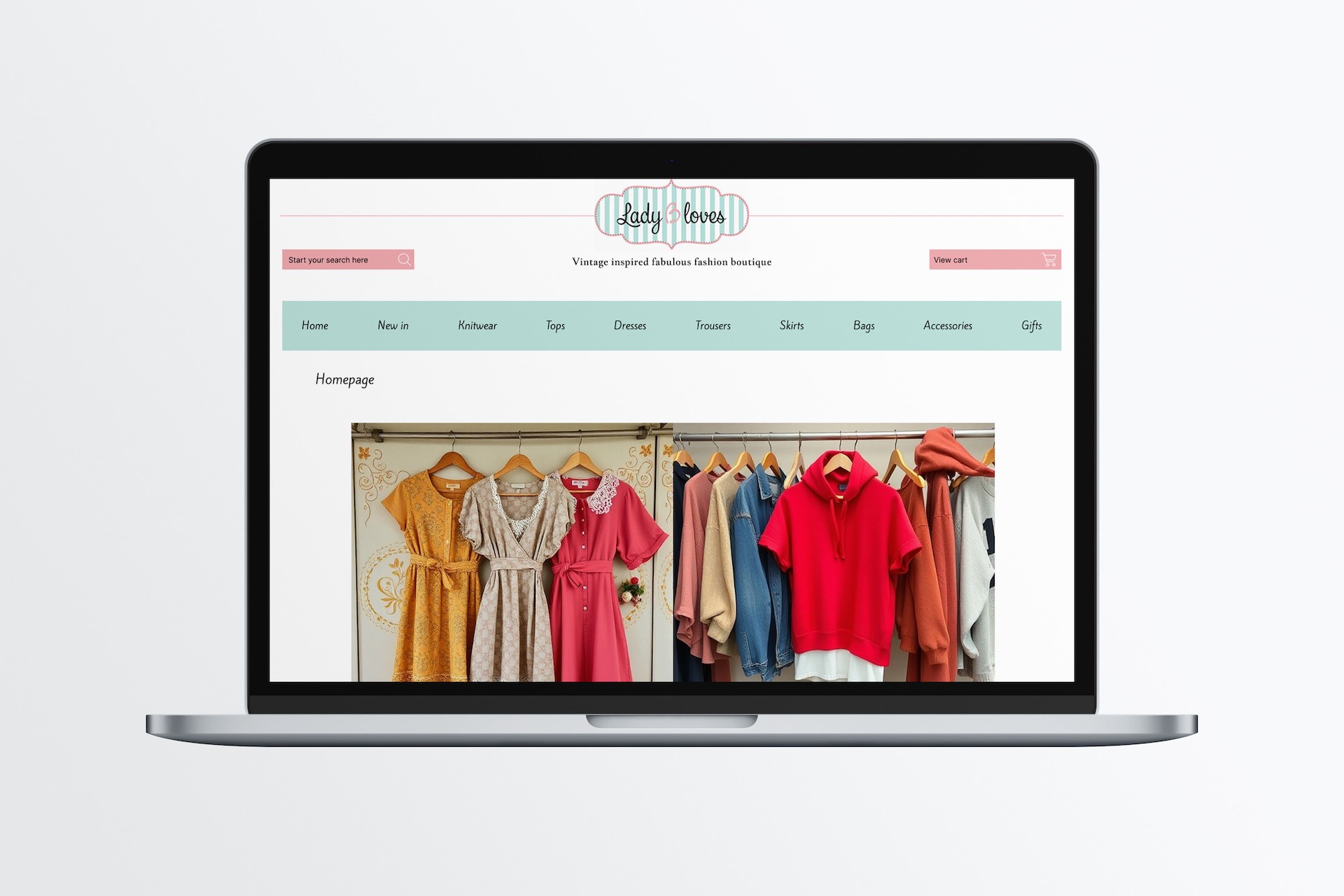
Mock up
When I was happy with my design I put it into a mock up so that I could see how it looked on a laptop screen.
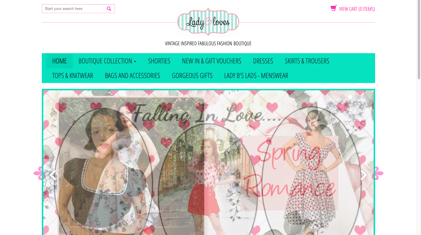
Before the redesign
These were the pages on the website before I redesigned them, I am really happy with the change and I think that my design has really improved the website.
Evaluation and Reflection
As this was my first project in UX design I am really pleased with how this came out. I think with keeping the branding it showed the same website but with better UX and UI, I think I did a great amount of research and think this worked really well. If I had more time the only thing I would do is add more pages and remake the entire website.