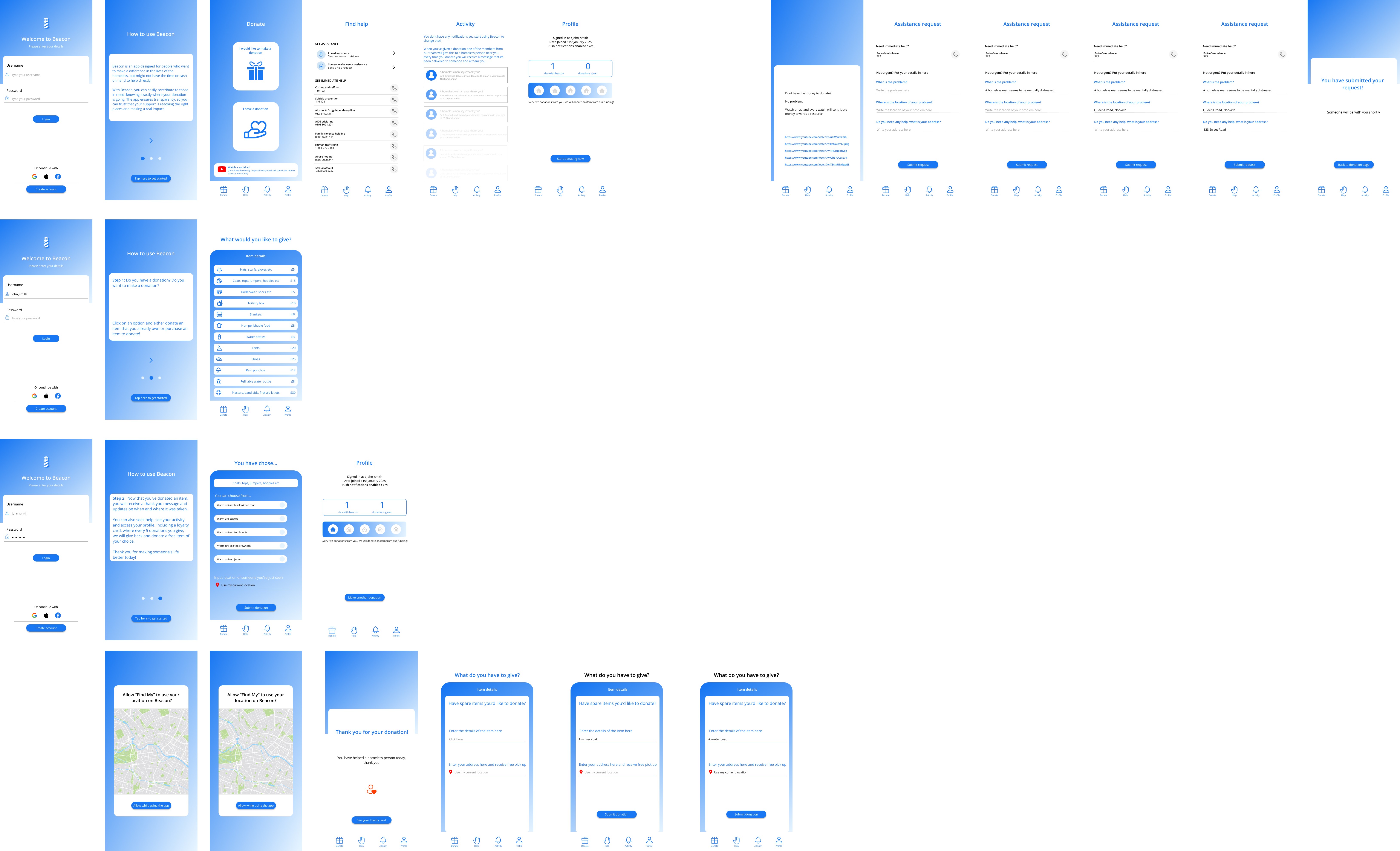
Beacon
Welcome to my app Beacon, I created this to provide a trusting way for people to donate to the homeless.
The problem
I made this app to focus on the sustainability issue of poverty. I looked specifically into the homeless sector and why its such a problem. I found out that people have stopped giving to the homeless because of trust issues. So my aim was to make people give to the homeless again in a way they trust.
The method
Research
User testing
Wire framing
Mid-fidelity designs
High-fidelity designs
Communicating
Research:
User testing & Interviews
I started doing user testing and interviews. I gathered 5 users and asked them some questions that would help me towards creating an app. I then summarised all these interviews so that I could easily reflect upon them.

Statistical research & creating personas
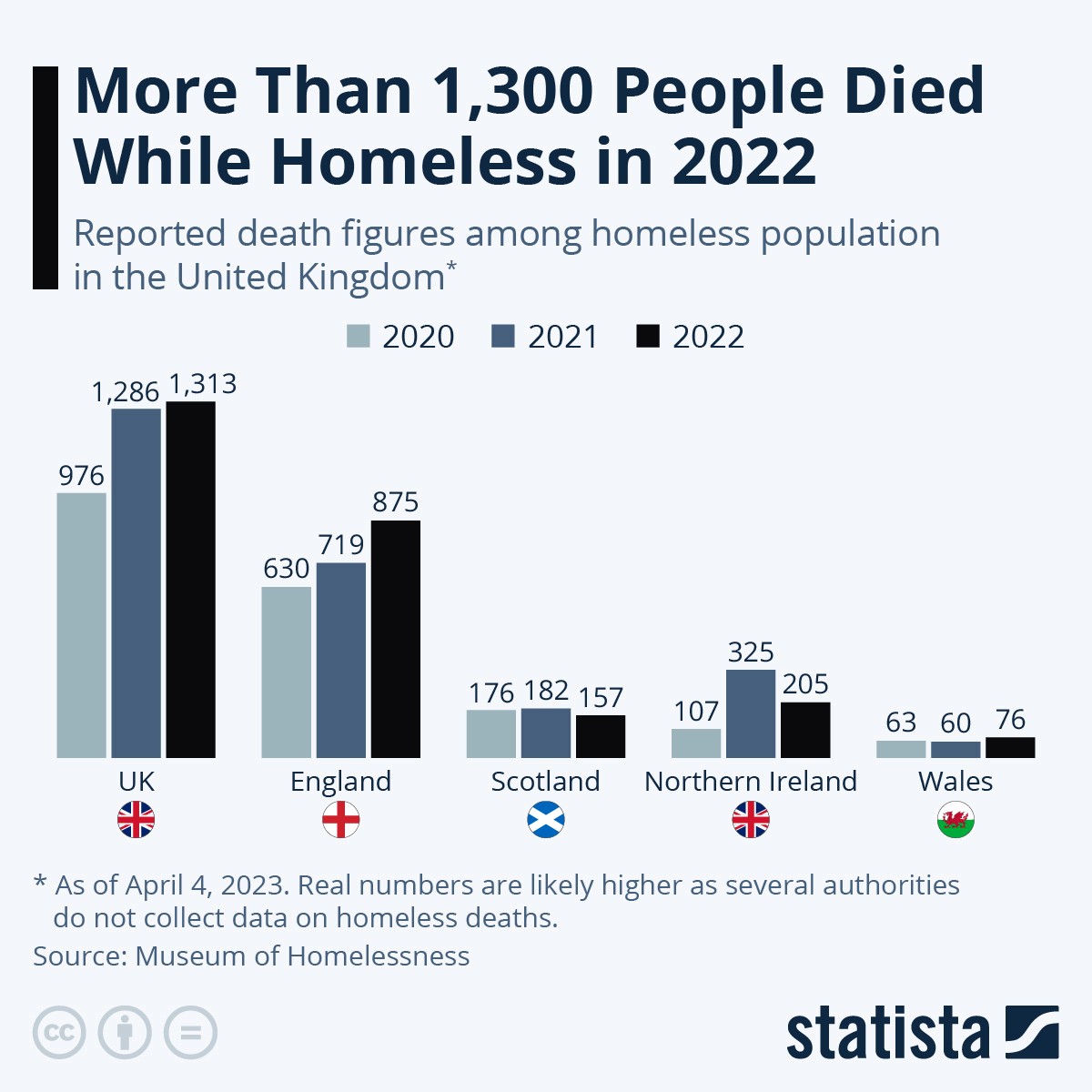
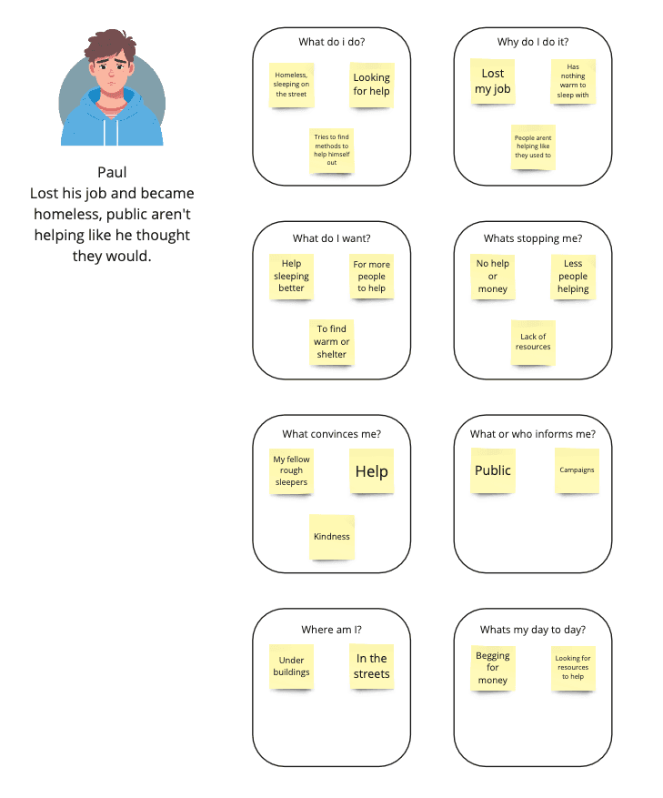
I then did some research looking into statistics, I looked into how many homeless people die a year, and that got me thinking into what could prevent these deaths, and what resources could help them. I then created three different users of my app, two targeting helping the homeless and the other user would be a homeless person using it to get help. Creating these users made me realise what certain people would want for my app and what I could include and design.

Beacon
Welcome to my app Beacon, I created this to provide a trusting way for people to donate to the homeless.
Design Process
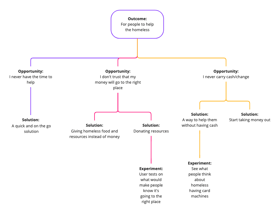
I then started to think about the design process and how I could structure it.I started by highlighting the main problems and thinking about how I could solve them.
Opportunity solution tree
Wireframes
I began thinking about what pages I want to include, where I would want buttons, images and text to be. Creating wireframes before designing really helps me to develop my idea further.
Mid-fidelity
I then started to place buttons and text, I also thought about colour aswell. I created this using figma.I also did a user test by this part to get feedback on my buttons and placements with icons.

High-fidelity
I then thought about design and branding my app so it becomes more professional. I kept the blue as my users in my test suggested that it was a safe welcoming colour, which was my goal.
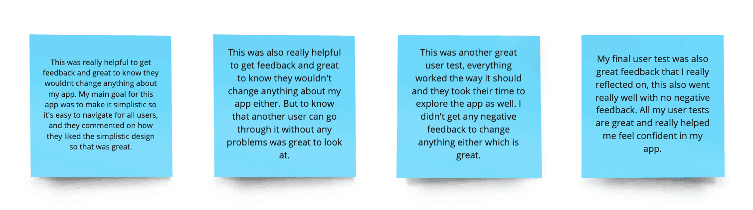
User testing
I then did some user testing on the same people that did my user interview to get there honest feedback on my app, to see if they were happy with the app and wether it would change their minds about donating to a homeless person. I got really
Communicating the app
App store images
I then moved onto starting to communicate my idea to my auidence, and created some app store images. I also created a presentation pitch and a promo video.

Mock up of main pages
Here is a mock up of a few of my main pages that I was really pleased with. I made this a fully functioning app using Figma.

Project Summary & Evaluation
I am so proud of this project, I started with a strong idea so I knew that it would go far, and im so passionate about the subject and it really touches my heart. I really challenged my skills from research to designing the app. I learnt so many new skills and techniques and Im so excited to create more things like this.